Typography
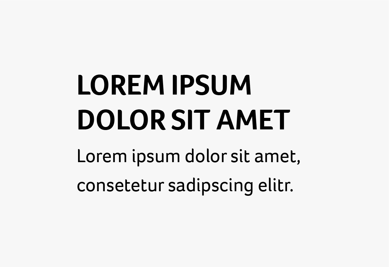
Typography is a main component of our design system. We use big fat all-caps bold lettering with soft corners for our Headines and important messages. For any other type we use the sans-serif, but yet classic and not too modern looking Lato.
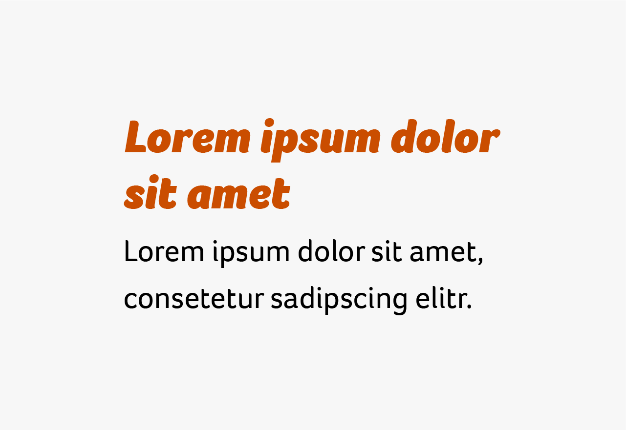
Introducing:A font, that fits the brand: bold lettering, rounded corners and totally flexible. Foco’s friendly, humanist curves deliver a typeface that is easily recognized and a great choice for branding.
-
![]()
Foco Light
-
![]()
Foco Regular
-
![Foco Bold]()
Foco Bold
-
![Foco Black Italic]()
Foco Black Italic


Emphasis
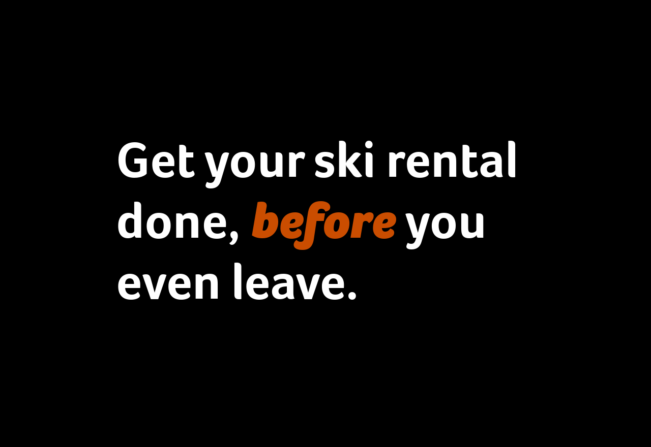
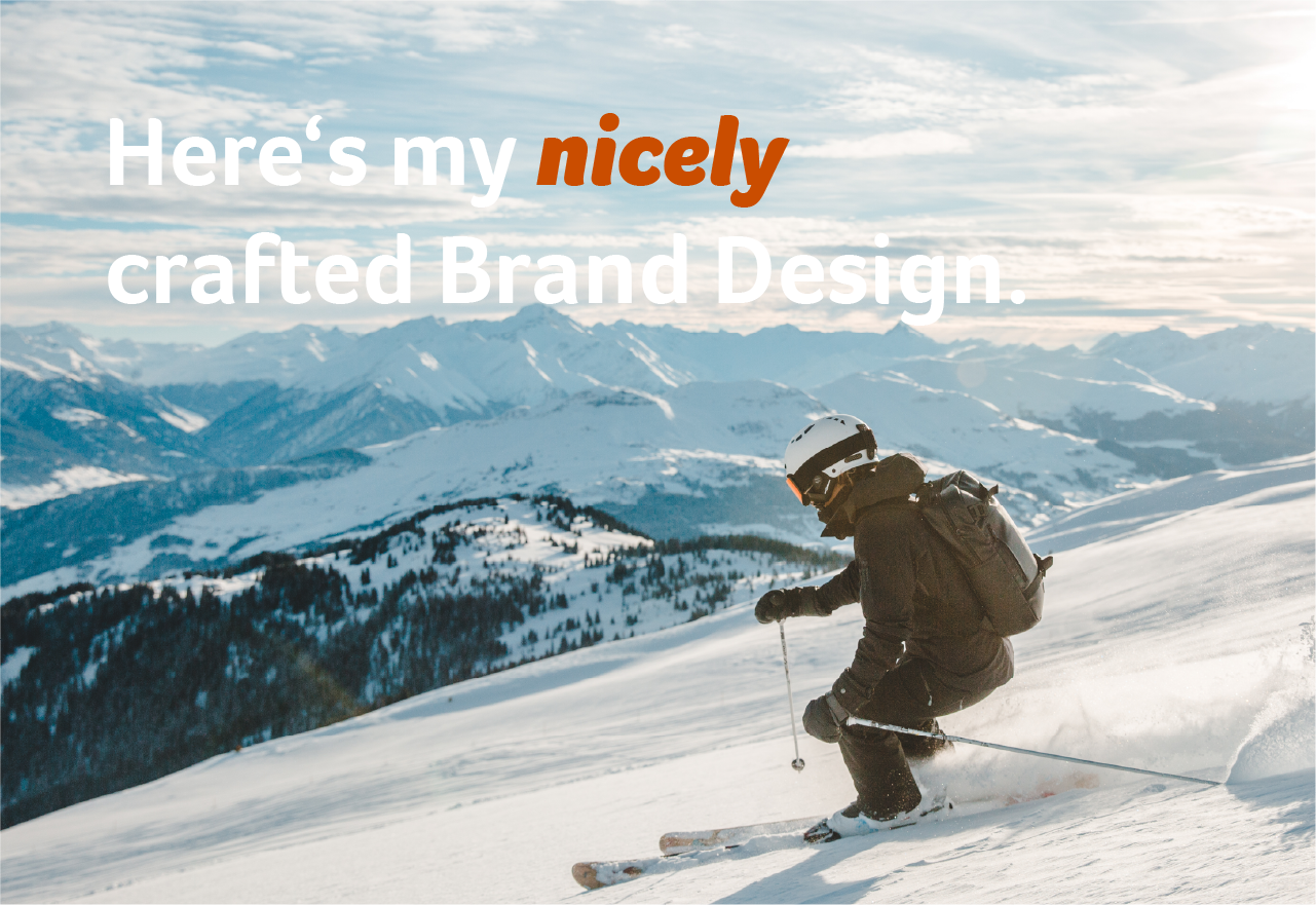
That's what we call Emphasis. When we want to highlight a specific phrase in a headline we go for that style. On an Alpy Red background, the emphasis is in Alpy Blue - on any other it's in Alpy Red.


Don’t use text emphasis on the whole sentence


Never use the emphasis in bodycopy
Learn more about text legibility guidelines on the color page.
Don’t use uppercase lettering
Line height
Line Height rules are pretty straight forward: Always add 8 pt. to your Font size.
Line height = Font size + 8 pt.
Font size 36pt. = Line height 44pt.
Font size 22pt. = Line height 30pt.
Font size 18pt. = Line height 26pt.
Font size 12pt. = Take a guess now!*
These guidelines are mainly built for graphical applications. There are additions and exeptions in our User Interfaces. For more info check our UI Guidelines.


*If you can guess the guess the Line height correctly you have the chance to win a glass of water, served by someone from the Marketing team. Good luck!
Depending on the use case, different rules can apply to typography which is placed on images
White text won’t be very legible here.


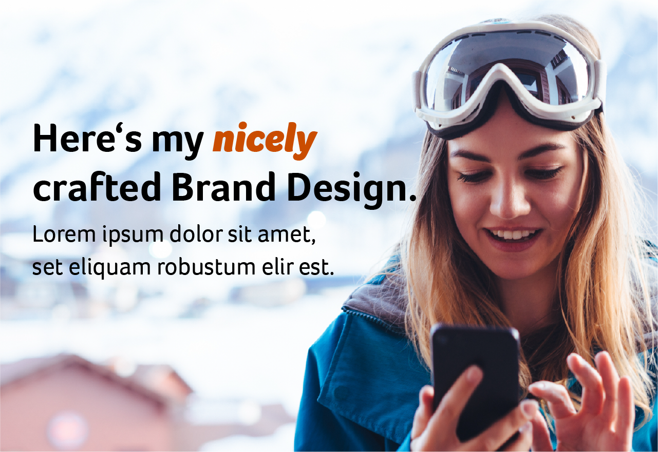
Use a darker brand color here.
Don’t write across people.
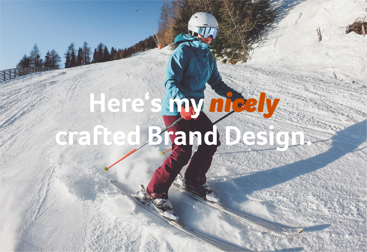
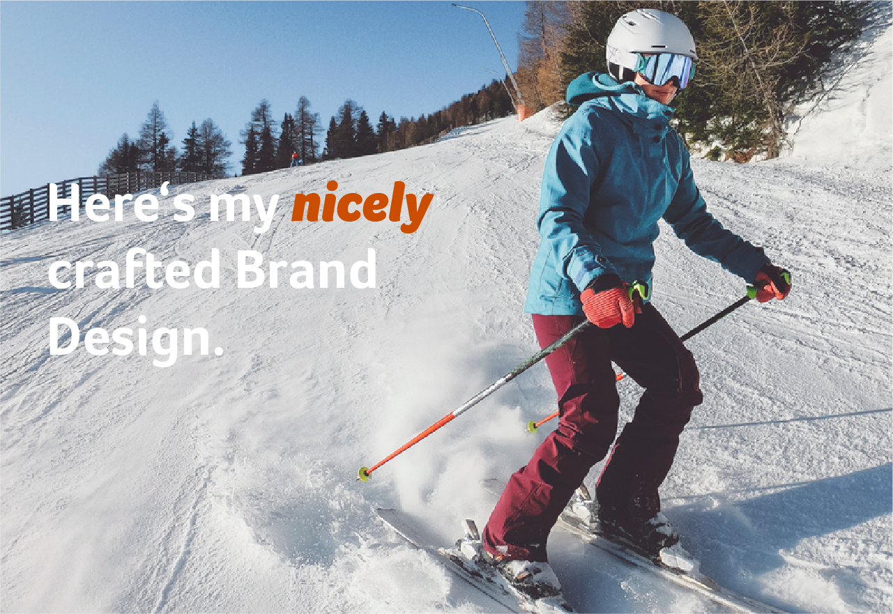
Arrange your image according to the best text placement.
Don’t use subheadlines or even body copy in images.

Find another solution or leave it out. Images are reserved for headlines.
Ground Rules
01. Work with the image to find the best layout
02. Don’t be afraid to reframe: Legible text over centered people
03. Black text is superior on White - White is favorable on color
Summary
01
Don’t use all-caps lettering
02
Use emphasis only on very important highlights
03
Text on Images is a good thing, but don’t overdo it